

Linia Presentations
Dotted Bar / Column Chart
Dotted Bar / Column Chart
Couldn't load pickup availability
Description
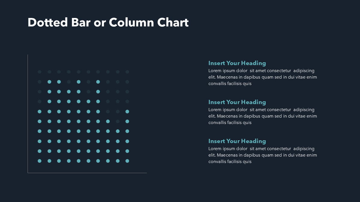
This modern and minimalist bar chart gives you a unique and interesting way to show your data or projections.
The chart consists of dots which you can easily recolor to make the bar chart display your data. You can easily remove columns by deleting those dots or copy and paste columns to make the chart larger.
If you're displaying data in percentages, each dot represents "10%" as there are 10 dots going from the top to the bottom. That makes it easy for you to decide how many to recolor to fit your data.
You'll get all displayed variations with your download.
✓ All text fully editable
✓ All colors fully editable
Tags
unique bar chart, custom bar chart, minimalist bar chart, column bar chart, fun ppt chart
Format & Delivery
Format & Delivery
You will receive a PowerPoint (.PPTX) file with this purchase.
If you'd like to use it in Google Slides, simply upload the file into Google Slides, and it'll automatically convert into an editable Google Slides presentation.